
Status: Shipped
Case Study
dESIGN SYSTEM
Established a unified design governance from the ground up, leading the design strategy and process for creating a Design System and Documentation Site.
Handoff Time Reduced by 50% / Improved Collaboration by 85%/ Achieved a 90% consistency rate

My role focuses on driving holistic design system and Documentation Site to improve UI consistency and quality, reduce redundancy, and make a unified experience across the NCLH Proxima applications.
My Role
Product Designer
Team
Product Owner
2 UX Designer
2 Developers
Duration
4 months
Problem
NCLH Proxima currently has multiple front-end development teams that do not coordinate their UX efforts. The teams are split across different teams with different Product Owners, causing usability, consistency, and reuse problems.
Goal
The approach for the version 1 release is to define and discover business needs, goals, and user requirements to align with a desirable design system in the organization’s context.
DISCOVERY
iNCEPTION wORKSHOP
I facilitated design thinking activities that focused on the current user journey map, uncovering user pain points and opportunities while guiding the strategic roadmap for the initial deliverable release.


Challenge 01
How might we encourage product teams to use the design system?
How might we make our customers/stakeholders part of the Design System? Buy In? Trust?
Challenge 02
How might we ensure a smooth handover to Devs?
How might we address the need for individual features vs. big mock-ups?

SOLUTION 01: DESIGN AUDIIT
Accessibility Brand Audit
In collaboration with the UI Designer, we conducted an accessibility audit of our brand to ensure that the product brand suite logo meets AAA compliance standards. We created a Brand Document to help other organizations apply the brand colors to their base templates effectively.
The audit provided clear insights for evaluating the existing brand colors selected by the Marketing team. We validated that these colors meet web accessibility standards, ensuring they are suitable for use on buttons, text labels, and related components.
Initial Assessment
establish GUIDING
prinplces
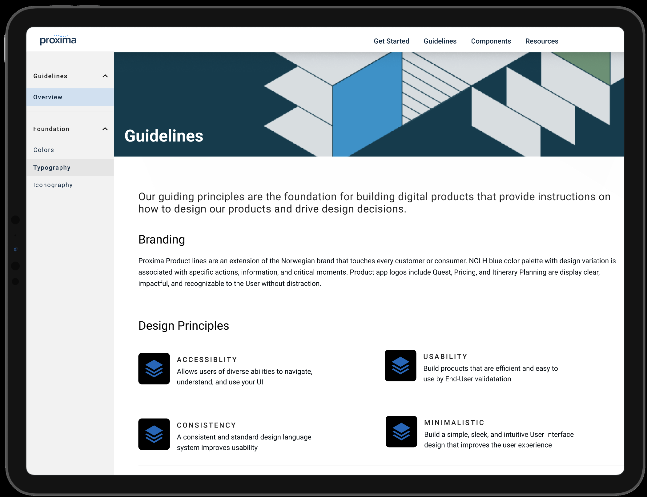
We established Design System Guiding Principles, which provide instructions on how to design our products. We use these to drive design decision.

Establish Visual Styles
Styles/Tokens
I used the Figma Tokens Plugin to sync and manage design tokens essential for building a design system. Every new component will be based on these tokens.
Design tokens include colors, spacing, typography, line height, and opacity. We use them instead of hard-coded values to maintain a scalable and consistent visual system for user interface development.


FOUNDATION BUILDING BLOCKS
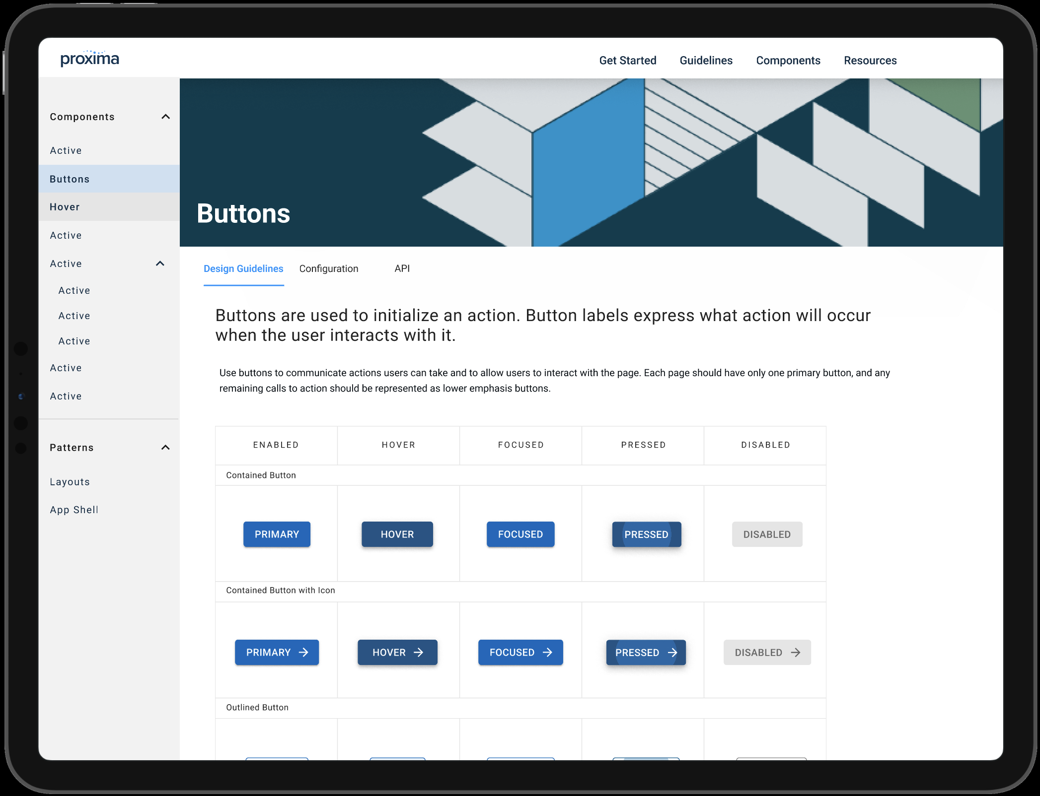
Component Library
- Apply Design Tokens/Styles to Base Component Library
- Ensures development and design are in sync and up-to-date
- Easy maintenance for the Design Team to keep Material Theme in sync with the library
- Adaptable, reusable, and shared amongst product teams
- Gather list components that need to document base usage and behavior in Document Site

DESIGN OPS: ONBOARDING
TOOLS FOR TEAMS
Figma: Design Collaboration
Figma Dashboard: Collection of projects help with onboarding & collaboration shared Component Repository
StoryBook: FrontEnd Repository
Design System Repository Storing and Organizing
Tokens // Variants Components Live Documents
solution 02
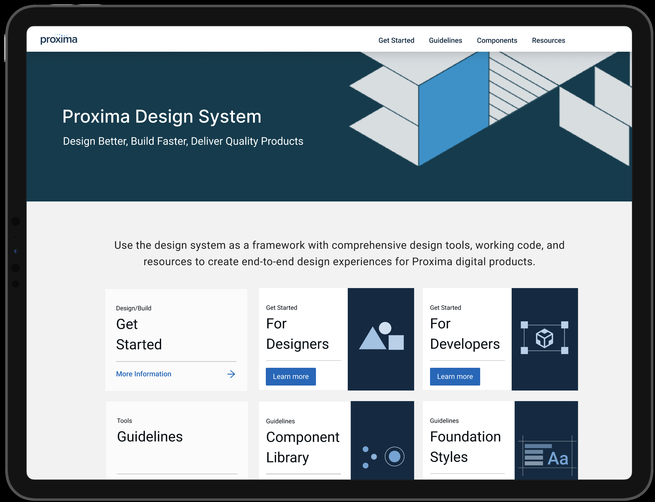
ds DOCUMENTATION SITE
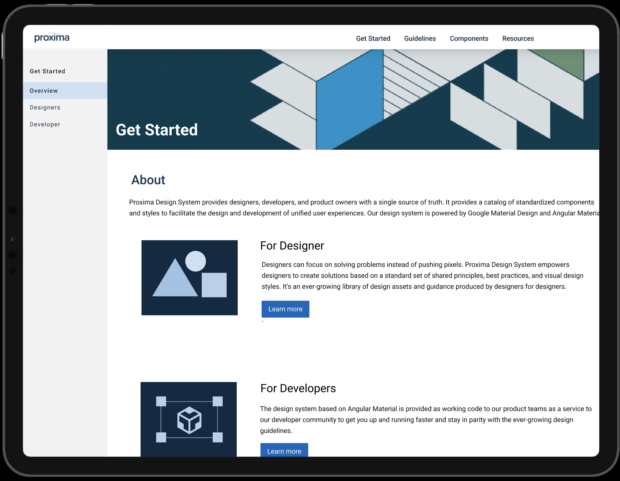
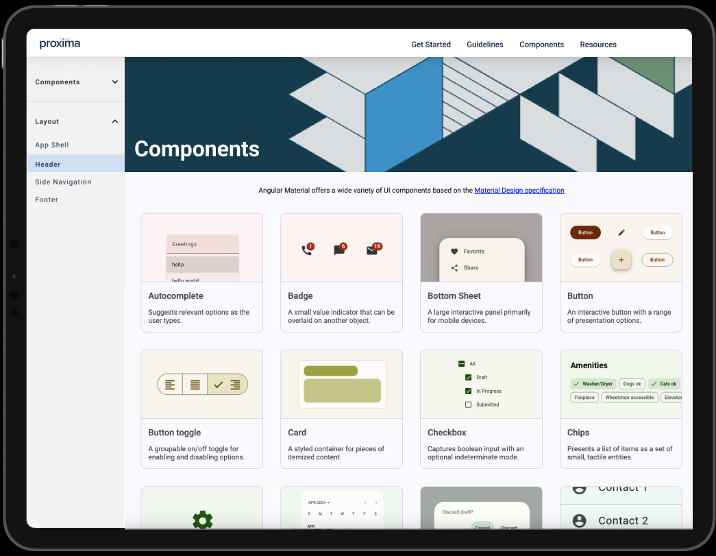
I collaborated with a UI Designer to create a component library in Figma that product teams could utilize. I dedicated 70% of my effort to building a custom documentation site powered by the Angular Material UI library. This site is a central hub for design system resources and tools, providing a single source of truth to establish design principles, best practices, and visual design styles. It offers guidance to inform and drive design decisions.
Based on the lessons learned from our workshop, we partnered with product teams to develop a To-Be-Journey MVP website, merging various ideas into a wireframe. I transformed the wireframes into high-fidelity mockups, relying on the component library as the foundation for design and development handoff. Additionally, I oversaw the UX content and directed the overall design and aesthetic of the website.
RESULTS
DESIGN SYSTEM/DOCUMENT SITE
Delivered Component Library and launched Document Site

What went well
Working with a collaborative cross-functional team
Established Stakeholder vision and Sponsorship from top-level
Product teams can use the design system as a shared ownership and resource to drive product consistency across the Proxima application.
What didn’t go well
The initial delivery was to build a design system document site for product teams to use as a single source of truth. Product teams needed a component library to start building and shipping products.Although we delivered the component library and launched Doc Site within 4 months. Time and budget constraints didn’t allow the adoption of the component library to the next evolution phase.
Opportunity
This is an opportunity to grow the Design System to the maturity phase. A design system is a living product that is constantly evolving and needs to be maintained to ensure a consistent user experience.